FNQ Lodge
A booking website improvement project focused on clearer page structure, better mobile use, and an easier path from browsing to booking.
Improvements for an accommodation website with booking and checkout flow.
Help guests understand the stay, trust the property, and move toward booking.
Cleaner structure, better mobile usability, stronger booking path, and before-and-after proof.
Built to make the property feel clearer, more trustworthy, and easier to book
Accommodation websites need to reduce uncertainty. Visitors need to understand the property, trust the experience, check availability, and move through the booking path without friction.
The site needed a clearer story and a better booking path
Visitors needed to understand the property more quickly, feel confident in the stay, and move from browsing to booking without being slowed down by awkward layout or clunky flow.
Cleaner layout, better booking flow, mobile fixes, and stronger trust
The work focused on practical improvements to make the website feel cleaner, more usable, and easier for guests to act on.
The difference becomes obvious when the flow is shown clearly
These screenshots show the old version, the improved presentation, and the cleaned-up booking path.
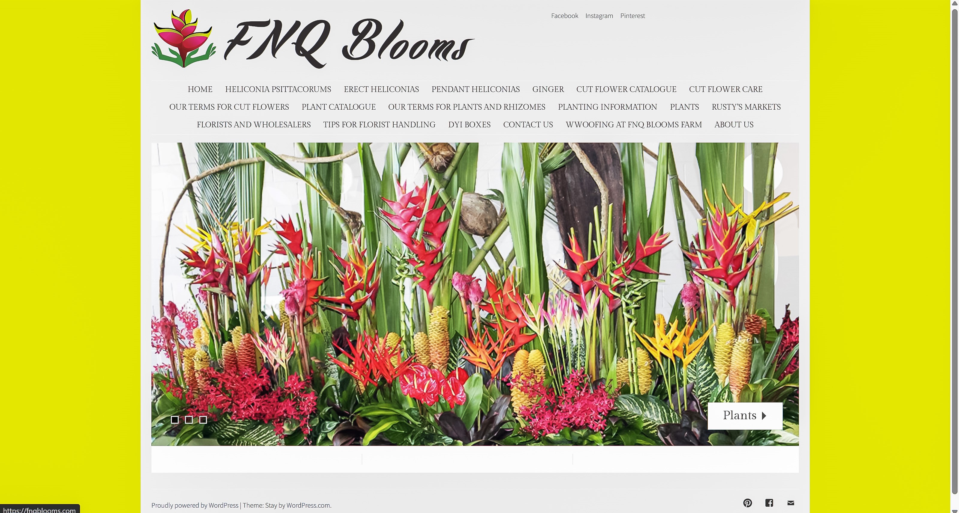
Before the cleanup
The previous version worked, but the presentation felt clunkier and the path toward booking was not as clean as it needed to be.
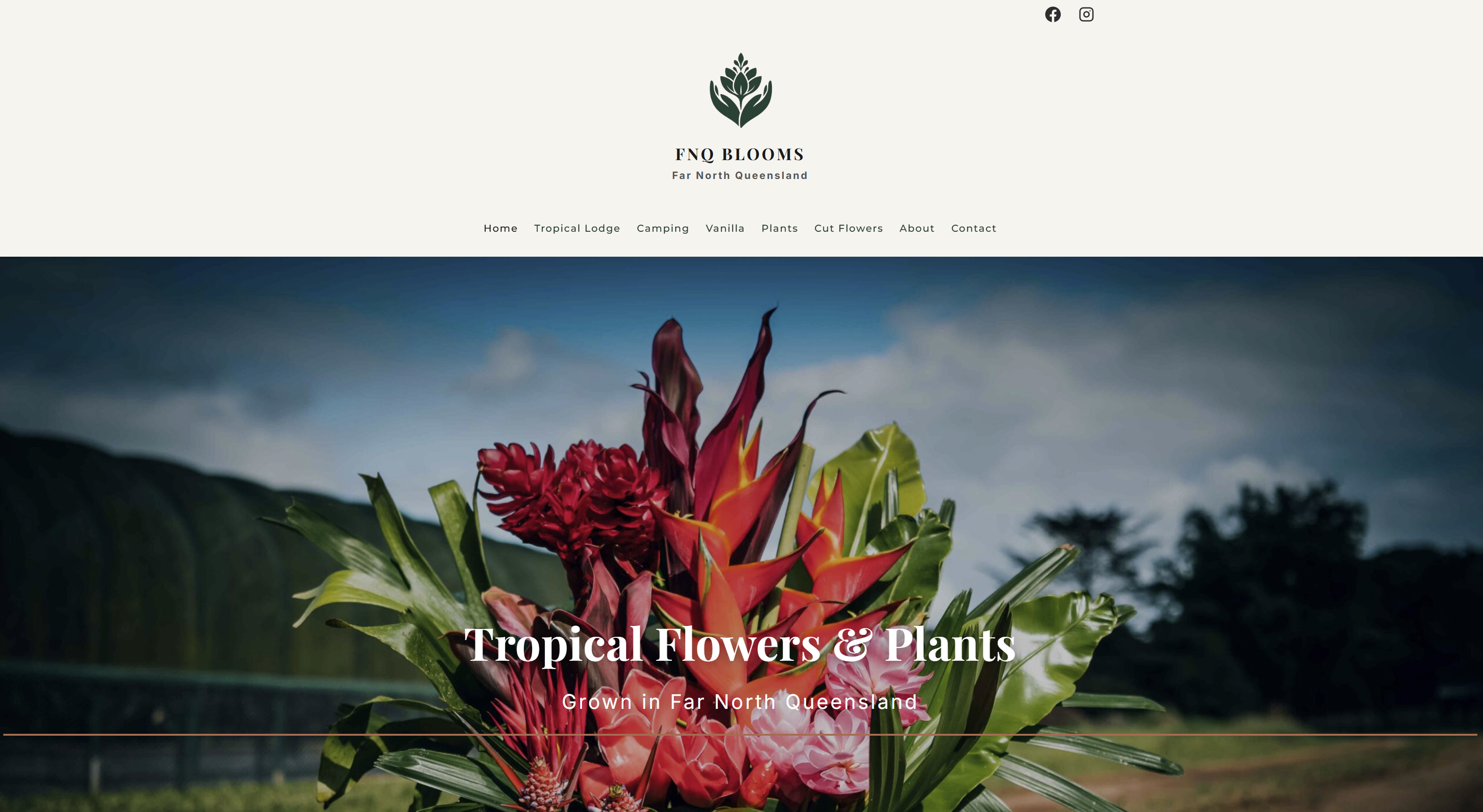
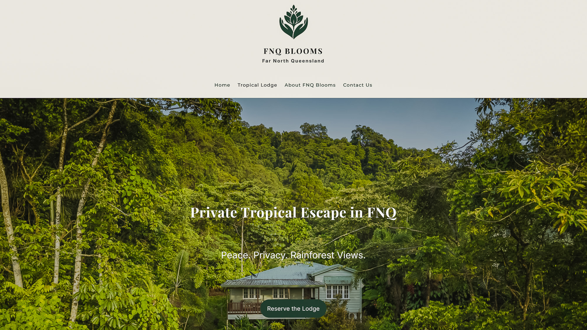
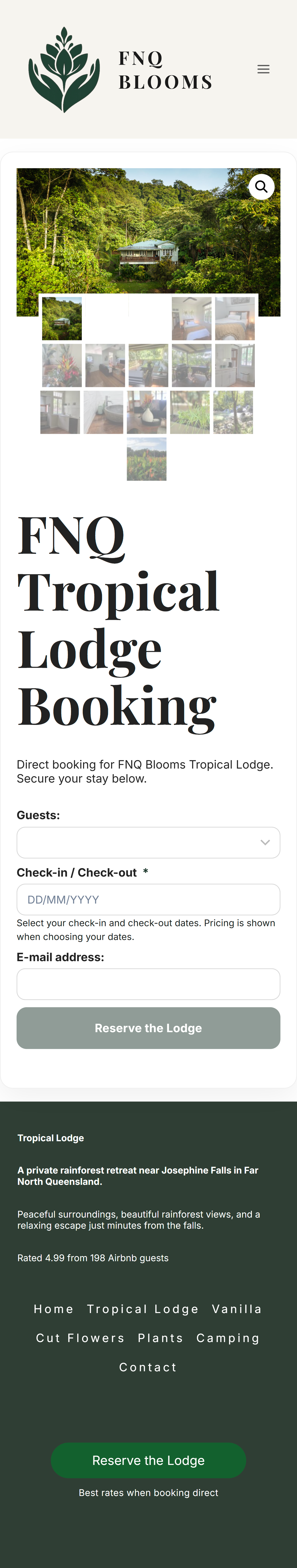
After the refresh
The improved version gave the property a cleaner structure, stronger presentation, and a clearer path for visitors to keep moving.
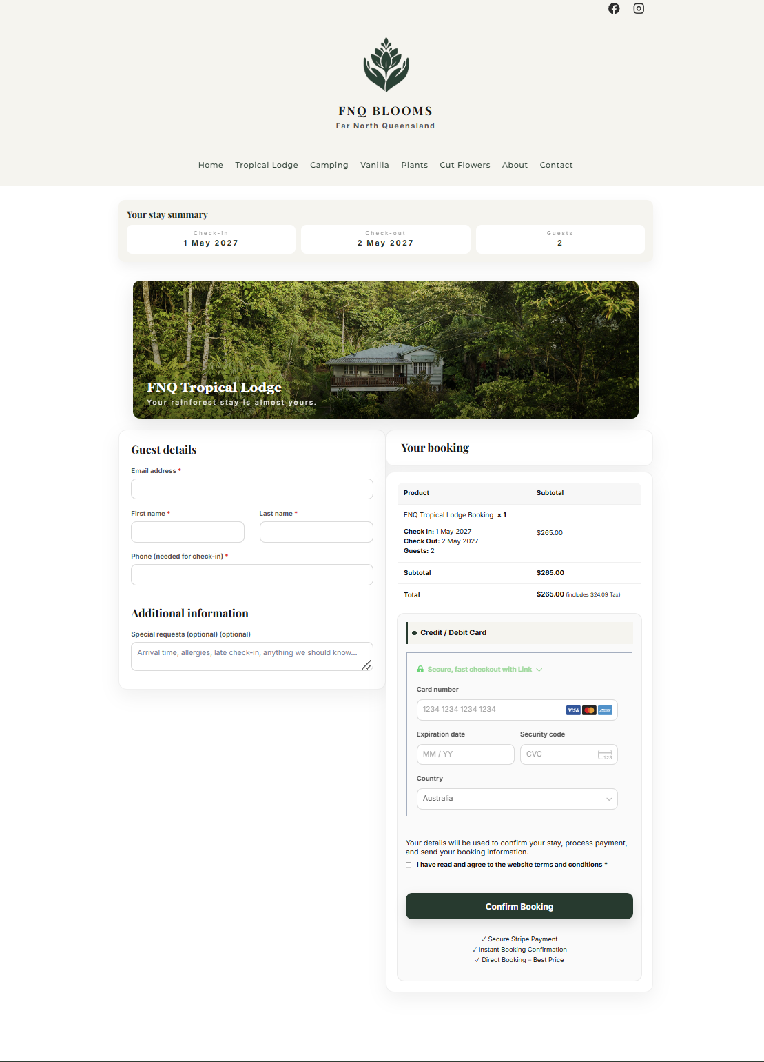
Checkout flow
The checkout layout was cleaned up so booking details, guest information, and payment felt easier to understand.
The mobile booking experience needed to feel easier and cleaner
Guests are often browsing accommodation on their phone. The booking page needed to feel readable, usable, and clear enough for people to keep moving.
The lodge needed to feel more polished, trustworthy, and appealing from the first look.
The flow was shaped to help visitors move from interest to booking with less confusion.
Booking pages and key content needed to work better for visitors browsing on their phones.
The site was improved without needing to completely rebuild everything from scratch.
Not every project needs a full rebuild to create real value
Sometimes the strongest result comes from improving what already exists: cleaner layout, clearer booking flow, better mobile usability, and a more trustworthy feel for real guests.
Make your website easier for customers to trust and act on
If your booking flow feels clunky or your current site does not show the experience properly, a focused refresh can make a big difference.